
Creating a Bold Digital Presence for The Funky Marketers
Published on May 18, 2026
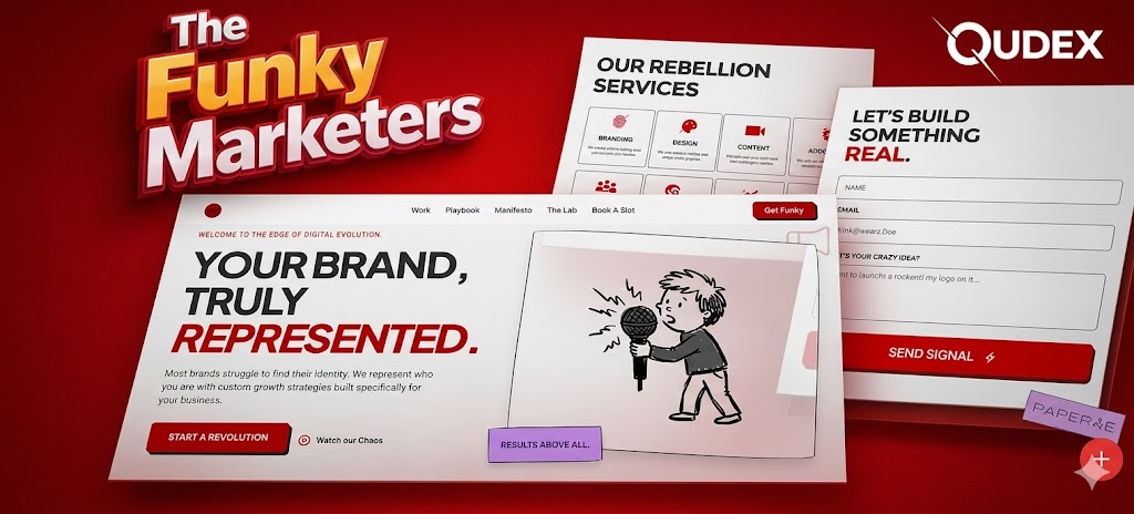
How Qudex Built a Website That Actually Feels Like The Funky Marketers
A behind-the-scenes look at designing a bold, conversion-focused digital experience for a creative agency that refuses to be boring.
By:Qudex Team Client:The Funky Marketers Service:Full Web Design & Dev
link - thefunkymarketers
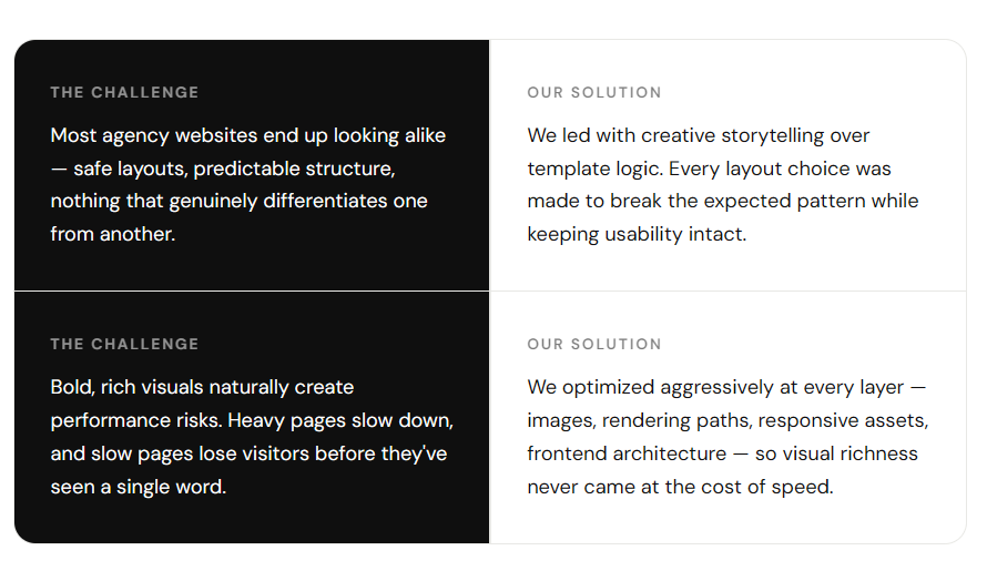
Most agency websites look like they were built from the same template. Clean. Neutral. Safe. The Funky Marketers is anything but — and their website needed to show that the moment someone landed on it.
When they came to us at Qudex, the brief was both exciting and challenging: build something that captures their raw, rebellious creative energy without sacrificing clarity, performance, or the ability to actually convert visitors into clients. Here's how we made it happen.
Getting Under the Brand's Skin
Before a single wireframe was drawn, we spent real time with The Funky Marketers to understand not just what they do — but how they think. Their energy is irreverent. Their clients come to them when they're tired of the same old marketing playbook. That attitude needed to be unmistakable on the website.
The words that kept coming up in our discovery sessions? Bold. Human. Premium. Unexpected. We held onto those words like a compass throughout every design decision.
 That meant no stock-photo hero images. No corporate blue color schemes. No "We are a passionate team of experts" copy. Instead — strong typography, a signature red that commands attention, and a content flow that tells a story rather than ticking boxes.

Building a Story, Not Just a Page
There's a difference between a website that lists what you do and one that takes you on a journey. We designed for the latter. Every section of the site was mapped to a specific emotional beat — curiosity, trust, excitement, and finally, action.
Visually, we committed to a system built around high contrast and intentional restraint. Bold red as the brand color. Clean white breathing space to let content land. Typography with real personality — not the usual safe choices. The result is a site that feels editorial and confident, like a magazine cover for a brand you immediately want to know more about.
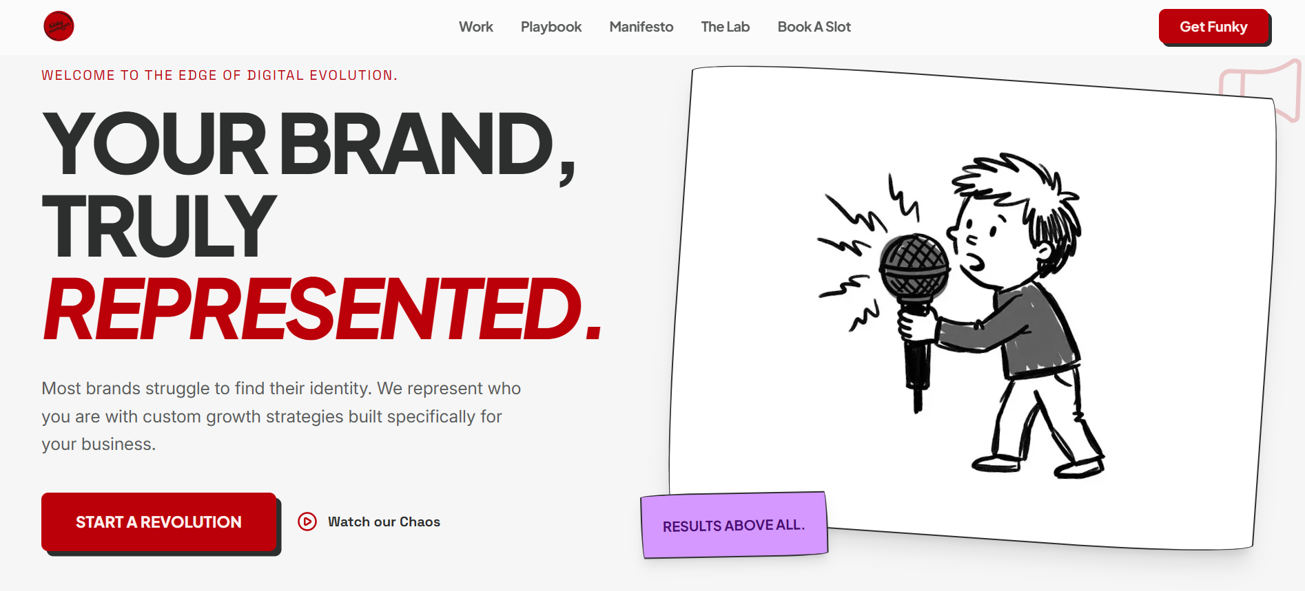
The First Four Seconds Matter Most
We obsess over hero sections at Qudex. Research is consistent: visitors decide within seconds whether they're staying or leaving. That window is your entire first impression budget.
For The Funky Marketers, we designed a hero that hits hard — oversized type, a visual contrast that snaps you awake, and messaging that immediately communicates the brand's personality, not just its services. The goal wasn't to explain everything. It was to make the visitor feel something and want to know more.
The primary CTA was placed within immediate view, with zero friction between curiosity and click.
Looks Great on Every Screen — Because Most Clients Browse on Their Phone
A website that only shines on a 27-inch monitor is a website that's leaving conversions on the table. We built the entire site mobile-first, testing relentlessly across screen sizes, orientations, and resolutions to make sure nothing felt compromised on smaller screens.
Spacing was recalibrated. Typography scales were adjusted. Navigation rethought for thumb reach. The visual hierarchy — essential to keeping bold design from becoming cluttered — was preserved at every breakpoint. What you get is a consistent, premium feel whether someone's visiting on a phone during their commute or on a desktop at their desk.
Making It Easy to See Exactly What's on Offer
The services section had one job: let someone scan quickly and understand what The Funky Marketers does. No walls of text. No nested menus. Clean, consistent cards — each one holding its own visual weight and leading clearly to more detail.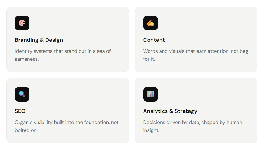
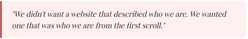
"Let's Build Something Real" — The Contact Section We're Proud Of
Most contact sections are afterthoughts. A generic form dumped at the bottom of a page, next to a stock photo of a phone. We treated this section as a conversion moment that deserved real design thinking.
The copy does the heavy lifting: "Let's Build Something Real" signals that this isn't just an inquiry form — it's the start of a genuine working relationship. The form itself is stripped back to the essentials. No unnecessary fields, no confusing dropdowns, no friction. Just a clear, warm invitation to connect — backed by a CTA hierarchy that makes the next step obvious.
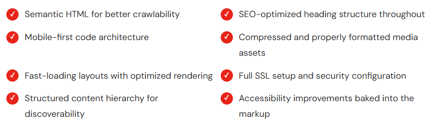
Beautiful Is Only Half the Job — It Also Has to Perform
Visually impressive websites that load slowly or rank poorly on search engines are a missed opportunity. At Qudex, we build the technical foundation as carefully as the design layer. For The Funky Marketers, that meant:
 We also handled end-to-end deployment — production hosting, performance optimization, and security setup — so the client got a complete, launch-ready platform without having to coordinate between multiple vendors.
What Made This Project Genuinely Hard
Every project has its friction points. These were the two that pushed us hardest on this one — and where we're most proud of what we found.
A Website That Does What It's Supposed To
When everything came together, what we delivered wasn't just a site that looks good. It was a platform that works — for the brand, for the business, and for the people who land on it.
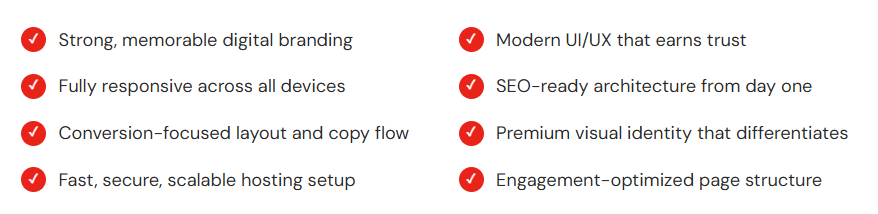 It now sets the standard for what a creative agency website can and should look like — and we're proud to have built it.
Why a Website Is Worth Getting Right
The Funky Marketers project is a reminder of something we believe deeply at Qudex: a great website isn't just a digital brochure. It's a 24/7 salesperson, a brand ambassador, a trust signal, and a storytelling platform — all at once.
When you invest in getting it genuinely right — the design, the performance, the technical foundations, the copy architecture — it doesn't just look better. It works better. It builds real relationships with the people who find it. And it gives a business the foundation to grow.
That's what we show up to build every time.
Ready to scale?
Set up a discovery call with our experts to discuss how Qudex can elevate your digital infrastructure. No strings attached.

